Monday, May 4, 2020

On Peer Critique, Part One


Over the course of the quarantine, I've been involved in a small online art group. We come up with a weekly theme and then share artwork via email; it's simple but good. I've been enjoying it immensely.

This week, at the request of a few of our members, I wrote up a short essay on peer critique. I've been involved in peer critique for decades, and I feel like I've seen it all. I'm going to publish my thoughts here in three parts. 


On Giving Critique

Believe it or not, giving is the more important half of peer critique. In my experience, you learn more by formulating and giving good comments than you do from most of the comments you receive. At least 75% of the commentary you get will be more or less useless, and the 25% that is useful will come from completely unpredictable sources.

On the other hand, every single piece of thoughtful commentary you give will help you. You’ll expand your art vocabulary. You’ll expand your knowledge of techniques- those that work and those that don’t. You’ll learn what you want to do more of, and what you wouldn’t do in a million years. You’ll get better at following an artist’s inspiration and process step-by-step, and since art is a form of communication, you’ll be that much more able to appreciate subtlety and nuance.

Perhaps most importantly, you’ll develop your own inner critic. Most of us have an immature, stupid inner critic, especially when we start out. It’s like a junior-high kid or an internet troll: all it wants to do is tear things down, both things it doesn’t understand and its own things too, just for spite. Some folks make the mistake of trying to ditch the inner critic, but that’s not helpful in the long term; what you want to do is help your inner critic grow the eff up.

You need a solid, helpful inner critic that can tell you gently and kindly when you need to improve something, when you need to toss something out and start again. You need an inner critic you can trust, who can actually say, “Hey, that’s really good. I see how much improvement you’ve made on this technique you’ve been practicing, and I’m proud of you. Now, here’s the area you could start working on next….” Your inner critic should be your friend, but you do have to train him or her.

Peer critique helps with that. Exercising your art skills, your observational skills, and your human empathy as you make good comments on others’ work models that behavior for your own inner critic. Over time, it works.


(next section: On Taking Critique...coming soon)


Friday, March 6, 2020

Rhododendrons, Before and After

Rhododendron x 'Neon'
Laura Allen, 2020
This was the last week of Cornell's advanced techniques class in botanical illustration, and for my final project I decided to revisit the rhododendron.

Earlier in the year I'd painted a spray of rhodie leaves using Rosie Sanders' video as a guide; while this class didn't really focus on watercolor per se, I wanted to see how much progress I'd made in general. It was an intensive few weeks, and I feel incremental improvements here and there.

Let's see.


The painting at the top is my final project. I found this gorgeous 5-gallon rhodie at my local nursery and bought it right up. The variety is 'Neon' and it claims to have peach-orange flowers; I won't know for another couple of weeks, but the buds are amazing.


Those buds are what I wanted to capture. They're so colorful and precise, slightly furry in spots and just gorgeous.


As usual, I started with very thorough drawing. I used Rosie Sanders' suggested blue/violet mix to paint in the areas around the highlights, and then worked in many, many layers of glazes.


Quinacridone gold is one of my absolute favorite colors, and I was able to really work it here. That, along with Venetian red and perylene scarlet (mixed with standard ultramarine and Hansa yellow,) is what makes up the majority of the oranges, rusts, and browns you see.


Here are a few more process shots. You can see the development of the underpainting, and visualize the layering on of glazes.


All in all, this painting makes me happy. There are spots, of course, that I don't like, but overall I think it's a success. I like the composition, the tonal range, and the color accuracy. My watercolor technique is getting better, so while I can totally point out the lapses and muddy spots, I'm still really pleased with the progress.

I'll do a post on the class itself some time next week, once I get everything wrapped up and submitted.


For now, here's the earlier rhododendron. I see definite improvement.

Rhododendron leaves painted earlier in 2020

Friday, February 28, 2020

Thoughts on Prismacolor

Helleborus x ballardiae 'Pink Frost'


This week, one of our class assignments involved a colored pencil plant portrait. The original request was for a rose, plant and all, but growing roses are in short supply in a Pacific Northwest February. I really didn't like the idea of using a de-prickled florist's rose, so I found a nice blooming hellebore instead.

Hellebore (also called Lenten rose, among others things) is one of my favorite plants. We never had them back in the South, and maybe that's one reason I'm so taken with them. In the middle of winter, when nothing much is happening in the garden, here come the hellebores. Their colors are so unique, so minor-key: greenish purples, reddish-grays, greenish-whites. It doesn't hurt that there's so much lore surrounding the hellebore; their ethnobotanical history stretches back for centuries and spans multiple continents.


Capturing the full range of color was a real challenge. I'm not sure I could've done better with watercolor, or any other medium. Possibly a strong, expressionistic oil in bold strange tones? But the colored pencil did okay with the tonal range, especially the purplish-browns. The greens suffered, I think.

In fact, the whole painting isn't as strong as I'd like. Hellebores are so tough and have such a leathery, sculptural presence; colored pencil has always seemed to me a bit too delicate for many subjects, and this is one of them. It's a bit saccharine for a flower once described thusly (Quoted from theGoGardenNow blog):

"Sydney Dobell (1824-1874), in Balder, mused of 'hellebore, like a girl-murderess, green-eyed & sick with jealousy, & white with wintry thoughts of poison.'" 

I was warned that hellebore is nearly impossible to cut and paint, since it withers almost immediately. So I found an amazing potted specimen at the nursery down the road and now I'll have another of these beauties for the yard.

I used both Prismacolor and Faber-Castell Polychromos on 11 x 17 Arches hot press watercolor paper. I've made the mistake of using watercolor paper with colored pencil before, and it was a mistake again this time too. Perhaps it's the sizing, but the colored pencil tends to "bead up" or ball up, making little spots of waxy color that are nearly impossible to eradicate. I don't have this trouble on Bristol or other illustration boards.

Using a lot of pressure, assorted stiff tortillons, and nearly an entire colorless blender, I managed to smooth and mix the pigment. Maybe I'll remember next time and just get out the Bristol. It's a heck of a lot cheaper than Arches anyway. 

I have a feeling I'll be revisiting Helleborus again. It probably won't be this year, since these guys are starting to edge past their peak bloom season even now. I'll miss them, green-eyed thoughts and all.


Friday, February 21, 2020

Work vs. Spring

Here in the lower mountains of the Issaquah Alps, it's not really spring yet. This was our first week of sunny days and temperatures above the low forties, though, and it was painful to spend so many hours indoors.


In fact, I cut a few corners on my coursework this week, and while I wish I had some better work to show, in my defense: the peas are in. The French mignonette strawberries are in the cold frame. Half the world is sprouting.


I did manage to eke out a few pieces for class. This oakleaf hydrangea leaf in colored pencil represents one of the last hangers-on from my fall garden. I planted a little dwarf Hydrangea quercifolia last year (I seem to have lost the varietal name, but I'm still looking) and it's done well, well enough to leave me a leaf to draw, anyway.

Hydrangea quercifolia leaf, overwintered
Laura Allen, 2020


The leaf itself didn't last long once I plucked it. I had to work quickly, and not just because I wanted to get back to planting the new clematis. I used a light graphite underdrawing and then Prismacolor and Polychromos colored pencils. I did a light shadow layer first in slate blue, and then started working in earnest, section by section.


The petiole of this plant is quite hairy, and I wasn't sure how to render that in colored pencil. I think I did okay; I at least attained "fuzzy." I hear you can use an embossing tool, which leaves an indention in the paper that your colored pencil will skip over, but I haven't tried it.


Of the other work I did this week, I like this little American holly seedling best. On one of the sunny mornings this week, I took a stroll along our rudimentary trail through the woods. I always try to snip an overhanging branch here or pull up an encroacher there, and this little guy came up entire and intact.

I used watercolor and Micron pen, and he lived in my paint water between sessions.


Friday, February 14, 2020

Quick Post, Quick Pen

It's Valentine's Day and I have cake to bake, so I'll make this quick....

Here's a pen and ink sketch of my favorite houseplant, the fat-leaved variegated peperomia. I did this in one day, basically at one sitting, using Micron pens on Bristol.

As I've mentioned before, a solid pencil drawing underneath is absolutely key. I heard that for so long and said to myself, "Sure, yeah, makes sense," but then still went right ahead without making one. Part of it's due to my years in the fine art department. I was doing more expressionistic work at the time, and so was everyone else; underdrawings were out of vogue and we were encouraged to start painting immediately and "find the form in the process."

It's a valid way of working and I have some lovely paintings done in a more exploratory style, but for this work, the drawing is crucial.

I like working this way. It's both challenging and Zen at the same time.

Peperomia obtusifolia var. 'Variegata'
Laura Allen, 2020


Friday, February 7, 2020

Ink's Not So Bad


winter roots of Dahlia 'Manhattan Island'
Laura Allen, 2020

This week, three separate people have asked me about teaching. I've taught classes and workshops in the past; before I moved to Seattle, I made much of my living doing community courses, adjunct teaching, and adult workshops. 

(One memorable summer, I even taught a set design course for a large children's theatre program. Never ever mention "High School Musical" to me, and especially don't hum the songs. I have
trauma.)


Aside from that, though, I love teaching and I plan to do it again. One of the reasons I'm taking this botanical illustration course from Cornell is to build my nature art portfolio. It's always tough to do finished work in the rush of a class, but this dahlia is a keeper. 

The main reason this turned out so nicely is that I'm seriously intimidated by ink. My crosshatching is cruddy and so's my stippling; I'm just a bit too heavy-handed for ink, or something. So I made a very detailed pencil underdrawing, and used every pen trick I knew.

The best advice I've ever heard is from artist Alphonso Dunn. He recommends saving pens that are running out of ink to use for shading.


It works. This dahlia root was shaded almost entirely with running-out Micron .005 pens. I took my time; it's an eight-hour drawing or so, maybe a little more. Making sure all the root paths matched up was the challenging part. 

I drew the main roots first, with their major mixmaster intersections clearly indicated. There are one or two that got drawn over, but you'd have to get a magnifying glass to find them, I think. The
drawing is life-sized, by the way, as is common in botanical illustration. It's on 11 x 17 Bristol and I used .005 Microns almost exclusively.


So, for now, still brushing up the skills...be back next week.

Friday, January 31, 2020

"You're Such an Hermione"

According to my husband, I'm a bit of an Hermione. I know, I know...I'm a notorious know-it-all and I always do my homework, even the extra credit. If there's a question, my hand's the first in the air.

What can I say? I like classes. I like teaching classes, I like taking classes: it's basically all the same to me. So I'm really enjoying my first week of the online botanical illustration course through Cornell University's professional development department...so far, so good.


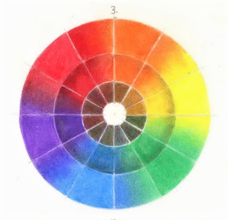
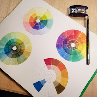
I'm taking the third and final class, Advanced Techniques, but of course we always start off with a few basics. Pencil gradation charts, negative space exercises, and colored pencil color wheels.


These two are my favorites. Number three above is a primary color wheel with experiments in mixing neutrals and adding shading. I used Prismacolor Warm Grey on the second wheel, and mixed complementary colors in the center.


Number four to the left is a wheel in what I'd call a minor key. (Not a primary person; I like the more complicated tones.) I mixed complementary colors in the center again, and the second wheel is a blend of the main hue with each of its neighbors.


These were good practice. Colored pencils aren't always easy to blend; I tried colorless blender, a blender pen from my Copic set, torts, stomp, and even white Prismacolor, all with mixed success.


I think I spent the most time on the wheels, but there's also this warm-up drawing in graphite. It was supposed to be a twenty-minute drawing; I spent a bit more time than that but tried not to get too fussy. Capturing the color variations on the skin of the squash was a challenge. Value changes and color mottling added together equals complexity (and fun) in rendering.

Cucurbita pepo var. turbinata
Acorn squash


 And one of the nicest and most unexpected helps of the first week? A writing assignment that will go a long way toward a future artist's statement. And that's no small thing, as anyone who's ever wrestled with artist statements knows.

"...One of the reasons I loved botanical science in the first place is the fascination I have for the specifics of plants. I love the differences between alternate and opposite leaves. I love the difference between the types of bark on trees. I love counting the number of petals, of stamens. I even love the names of things; I collect botanical names like a hoarder.

Every single plant- every leaf, stem, twig, bud, or seed- is utterly unique. There are no two alike, and that amazes me still. Why? Why is there all this incredible uniqueness? I feel that if I could figure out why this is so, I’d understand something really fundamental to the workings of the universe. As it is, it makes me happy to capture as much of that unique character as I can in a drawing or a painting. I want to make a record of just how beautiful even a leafcutter-riddled rhodie bough can be, with its life story written there in its color, its imperfections, its habits of growth...."

(I also wrote a bit about this on my other blog, The Packet Boat.I use that blog for less technical, more noodling sort of posts. For now.)

I'll be back next week with another update. Thanks for stopping in!