Friday, January 31, 2020

"You're Such an Hermione"

According to my husband, I'm a bit of an Hermione. I know, I know...I'm a notorious know-it-all and I always do my homework, even the extra credit. If there's a question, my hand's the first in the air.

What can I say? I like classes. I like teaching classes, I like taking classes: it's basically all the same to me. So I'm really enjoying my first week of the online botanical illustration course through Cornell University's professional development department...so far, so good.
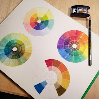


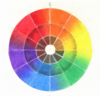
I'm taking the third and final class, Advanced Techniques, but of course we always start off with a few basics. Pencil gradation charts, negative space exercises, and colored pencil color wheels.


These two are my favorites. Number three above is a primary color wheel with experiments in mixing neutrals and adding shading. I used Prismacolor Warm Grey on the second wheel, and mixed complementary colors in the center.


Number four to the left is a wheel in what I'd call a minor key. (Not a primary person; I like the more complicated tones.) I mixed complementary colors in the center again, and the second wheel is a blend of the main hue with each of its neighbors.


These were good practice. Colored pencils aren't always easy to blend; I tried colorless blender, a blender pen from my Copic set, torts, stomp, and even white Prismacolor, all with mixed success.


I think I spent the most time on the wheels, but there's also this warm-up drawing in graphite. It was supposed to be a twenty-minute drawing; I spent a bit more time than that but tried not to get too fussy. Capturing the color variations on the skin of the squash was a challenge. Value changes and color mottling added together equals complexity (and fun) in rendering.

Cucurbita pepo var. turbinata
Acorn squash


 And one of the nicest and most unexpected helps of the first week? A writing assignment that will go a long way toward a future artist's statement. And that's no small thing, as anyone who's ever wrestled with artist statements knows.

"...One of the reasons I loved botanical science in the first place is the fascination I have for the specifics of plants. I love the differences between alternate and opposite leaves. I love the difference between the types of bark on trees. I love counting the number of petals, of stamens. I even love the names of things; I collect botanical names like a hoarder.

Every single plant- every leaf, stem, twig, bud, or seed- is utterly unique. There are no two alike, and that amazes me still. Why? Why is there all this incredible uniqueness? I feel that if I could figure out why this is so, I’d understand something really fundamental to the workings of the universe. As it is, it makes me happy to capture as much of that unique character as I can in a drawing or a painting. I want to make a record of just how beautiful even a leafcutter-riddled rhodie bough can be, with its life story written there in its color, its imperfections, its habits of growth...."

(I also wrote a bit about this on my other blog, The Packet Boat.I use that blog for less technical, more noodling sort of posts. For now.)

I'll be back next week with another update. Thanks for stopping in!

Friday, January 10, 2020

Watercolor Leaves, a la Rosie Sanders

Rhododendron leaves, watercolor on Bristol

I love Rosie Sanders. From her gorgeous book of English apples (aptly named The Apple Book) to her oversize watercolor irises, her work never ceases to amaze me.


So of course when I came across her instructional DVD on how to paint leaves in watercolor, I had to try it. I'm not as deft with watercolor as I'd like to be. I've used it abstractly to good effect for years and I use for travel sketches and the like, but I'm less familiar when it comes to making watercolor realism happen; I've always reached for the oils if it comes to that.


Since Rosie is one of the best, I ordered the DVD and waited as it made its way across the pond. It's really good, well-produced with several segments on different leaf effects. I watched it straight through and went to work.

The first experiment was a little sad, and it happened to some variegated pothos leaves (Epipremnum aureum.)
experimental pothos leaves

As you can see, my colors were not only muddy but off, and you can't tell the variegation from the highlights. Honestly, it's just kind of generally ham-handed. I chalk this one up to a.) overworking wet watercolor; b.) trying to mix on the page instead of on the palette; and c.) being in a rush and not thinning my glazes enough.

But hey, for a first attempt at using a technique, it's not really that bad. It's...well. Moving on, then.

A twig of winter rhododendron leaves from the yard were my second subject (Rhododendron sp..)
I'm not sure which species or cultivar they are; it was June when we moved into this house last year, and I'll need to see them bloom before making an attempt at identification. (I suspect they're either native species rhodies, or something cheap and plentiful. There's an awful lot of them.)


Since I was able to identify a few specific issues with the pothos painting, there was no point in repeating them. I used a much lighter hand this time, and made sure to get my mixes right before starting.

I did a color study first.

Not knowing better, I wanted to try Daniel Smith's Green Apatite Genuine as my base green. I felt like the granulation of the earth pigment would add to the sort of mealy green of the winter leaf. I love all of DS's Primatek colors, but I've since learned that many of them aren't great for using under glazes, as they tend to lift.

I got lucky this time, though. Mixed with Prussian blue, Hansa yellow, and a touch of brown madder, it worked.


I made sure I had a good drawing first, then started by outlining the highlight areas with a very thin mixture of Prussian blue and cobalt violet.


I then just worked around the drawing, developing it as slowly and thinly as I could, using dilute layers of green apatite genuine, Prussian blue, and Hansa yellow.


Brown madder was my main red (and I added it to my green in the warmer sections of the leaves) though I did add a touch of raw umber to the stems near the end.


The pic below represents the stage of "oh my god, is this done? This isn't done but how do I finish it and not eff it up?" Panic near the end of a painting is a specialty of mine. It's how I know I'm almost there.


The answer seemed to be to calm down and glaze.


It need to be darkened somewhat overall, particularly in the shadowed areas, but I also to bring it all into a coherent-looking painting. So I used a basically yellow wash over almost the whole thing (leaving off the white highlights,) sometimes modifying it with Prussian blue to keep the coolness of the shadows and receding planes.


Once I was happy, I removed the spray of leaves from its little tube and sliced the stem at a diagonal so I could paint that too.

And there it is!


I'm very happy with this one. It has better depth of color, fewer muddy spots, and a real clarity and specificity. As far as critique, I'll say that I wish it weren't so light in key, and that there were even fewer streaky, muddied spots. I also lost the small flower bud in the center; I didn't handle the values well and it just disappeared.

I also may not try a full WC painting on Bristol again. Somewhere in my studio there's any kind of paper you can imagine (I'm a paper hoarder, no joke) and I wanted to try out the Bristol; it worked okay, no buckling or tearing, but I think the surface isn't as forgiving of wet working as a nice-quality hot press watercolor paper. 

On to the next thing...!


Friday, January 3, 2020

Back to the Drawing Board


bigleaf maple leaf, graphite, 8x10

As an artist, I've roamed far and wide. My taste in experiencing artforms is very broad, so I've never been inclined in my own work to stick to one genre, nor even to one medium. Given all the beautiful, profound ways that humans express themselves, how does anyone ever choose?

galangal root, graphite, 11x14

But my love of green growing things has never wavered. From my original college botany major; to awkwardly winning "Yard of the Month" when I was twenty-five and much too young for civic awards; to the truly ridiculous amount of money I've spent on plants over the years, engagement with the plant world has been one of the few constants in my life.


When my art career started feeling stale and lifeless a few years ago, I eventually decided to go back to basics. My desire to just draw was almost overpowering; I'd been working in abstraction and concept-based art for quite a while, and it felt odd to want to simply render.


But I did it. Still doing it, actually; drawing for its own sake is one of the purest pleasures in life. And of course I drew plants. Trees. Downed trunks. Dried leaves. Almost anything plant-ish I could see,


I've decided to hang out here in the botanical art world for a while. I've enrolled in Cornell College's distance course in Botanical Illustration, and I'll record my experience here starting later in January 2020.

For now, it's good to start a new blog. I like starting blogs. It's also good to start a new artistic journey, one that's probably been a long time coming.

branchlet, graphite and colored pencil, 15x22